PINGPONG#9: building the letter
A new way to write
at the Renaissance
Whereas the earliest printers copied the Gothic letters used in medieval manuscript, the introduction of printing in Italy from 1465 changed typography. The printers naturally leaned towards the new Humanist script – the Roman – based on the Carolingian minuscule and the capitals used on Roman monuments.
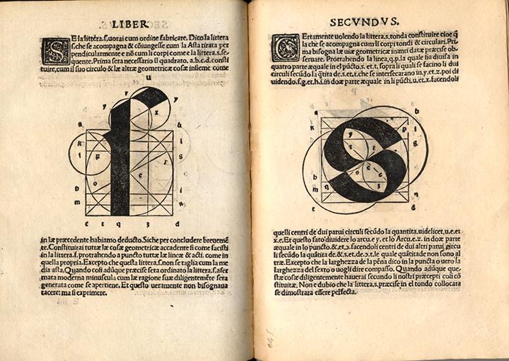
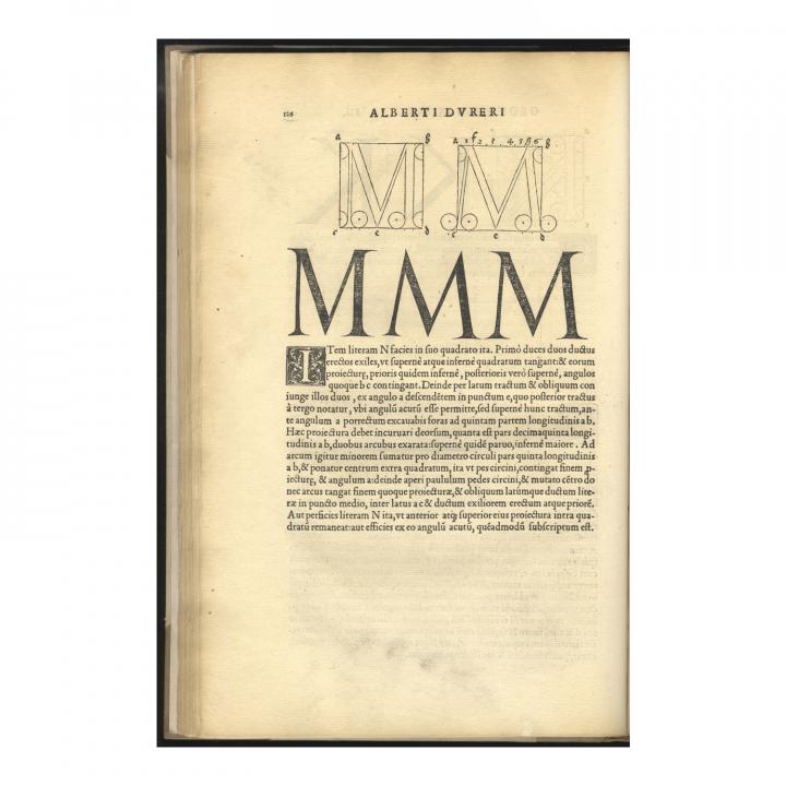
In the 16th century, mathematics and geometry were important tools in the quest for harmonious design, whether in painting, sculpture or typography. Many scholars attempted to construct letters on a geometric system like that used by the architect Vitruvius (1st century BC) and taken up by Leonardo Da Vinci.
Fanti’s treatise covers both calligraphy and typography, built on the theories of Fra Luca Pacioli (1509), applying them to gothic and roman characters. In France, Geofroy Tory published his Champ-Fleury (1529), with similar ambitions. The German painter, engraver and mathematician Albrecht Dürer dealt with the construction of letters in one of his work published by the important Parisian printer and bookseller Christian Wechel.
Trajan
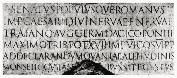
16th-century Humanists were not the only one to draw inspiration from Ancient scripts to create theirs. Carol Twombly, a former American font designer got inspired by the Trajan column in Rome and created the Trajan font for Adobe.
It seems this font was very, very famous in Holywood. It has been the only font not to be associated to one genre, being used for romcom, epic or horror movies as well as major TV shows.
Have you noticed? There is no lowercase because Romans only wrote with capital letters.
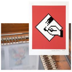
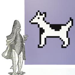
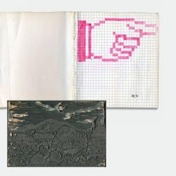
Carol Twombly’s work is part of the « Women in Type » unit in the exhibition icônes by Susan Kare. Divided in 4 parts, it takes the name from a research project led by the font designer and professor Alice Savoie, co-curator of the exhibition. The second part of this unit introduces to us 3 contemporary women of Susan Kare to whom font design industry owes a lot: April Greiman, Zuzana Licko and Carol Twombly.